|
Want to improve your presentation skills? Are you excited to learn better methods to communicate research? We scientists do cool stuff, and we want (and need) to convey our work to others. I have some hints to share. This past year, I've read lots of books, searched articles, and watched tutorials -- all in the quest of improving my scientific communication skills. Here are some ideas and tips I've been incorporating into my presentations. Maybe you want to try something new, too?!
#10. Be smart with how you use your slides. Slide design is a big topic, and I won't cover it here. But of course, you'll want to think about your slide use & design and how that will help you spread your science message! A few thoughts: do get comfortable with negative space on slides: Intentional empty space is fine! But at the same time, always make sure your graphics are large and clear -- visuals are important, and you put them there for a reason, so make them work for you! don't use a laser pointer: Design your slides so that you don't NEED to use a pointer. Instead, build on your slides using animation, so that arrows or emphases pop up when you need it. do use presenter mode, especially if you feel nervous about giving talks: Maybe this is an obvious one? I only started using presenter mode last year, and I have definitely benefited. There's a timer so you can use it to stay on schedule. But more importantly, I'd recommend you make good use of the notes section, since you can see your typed notes while you give a talk. Write and practice (and ruthlessly edit!) a script. Or write up and refer to your notes for topic prompts and transitions to help keep you on track and give a smooth and polished delivery. Keyboard shortcut to get into presenter mode at the current slide: (SHIFT+ALT+F5 /or SHIFT+ALT+FN+F5). Bonus for job talks: #11. Brand yourself at the beginning.
In a job talk, you are introducing yourself as well as presenting your research. The audience is interested to see you in a broader view than just the research you include, and you can help them by giving this context. Can you summarize your professional identify in one sentence?
I'd love to hear your suggestions or feedback on any of these hints! references:
Anderson, C. (2017). TED Talks: The Official TED Guide to Public Speaking. Mariner Books, 288 p. Bernoff, J. (2016) Writing Without Bullshit: Boost Your Career by Saying What You Mean. HarperBusiness, 304 p. Donovan, J. (2013) How to Deliver a TED Talk: Secrets of the World's Most Inspiring Presentations. McGraw-Hill Education, 240 p. Janzer, A. (2018) Writing to be Understood: What Works and Why. Cuesta Park Consulting, 219 p.
0 Comments
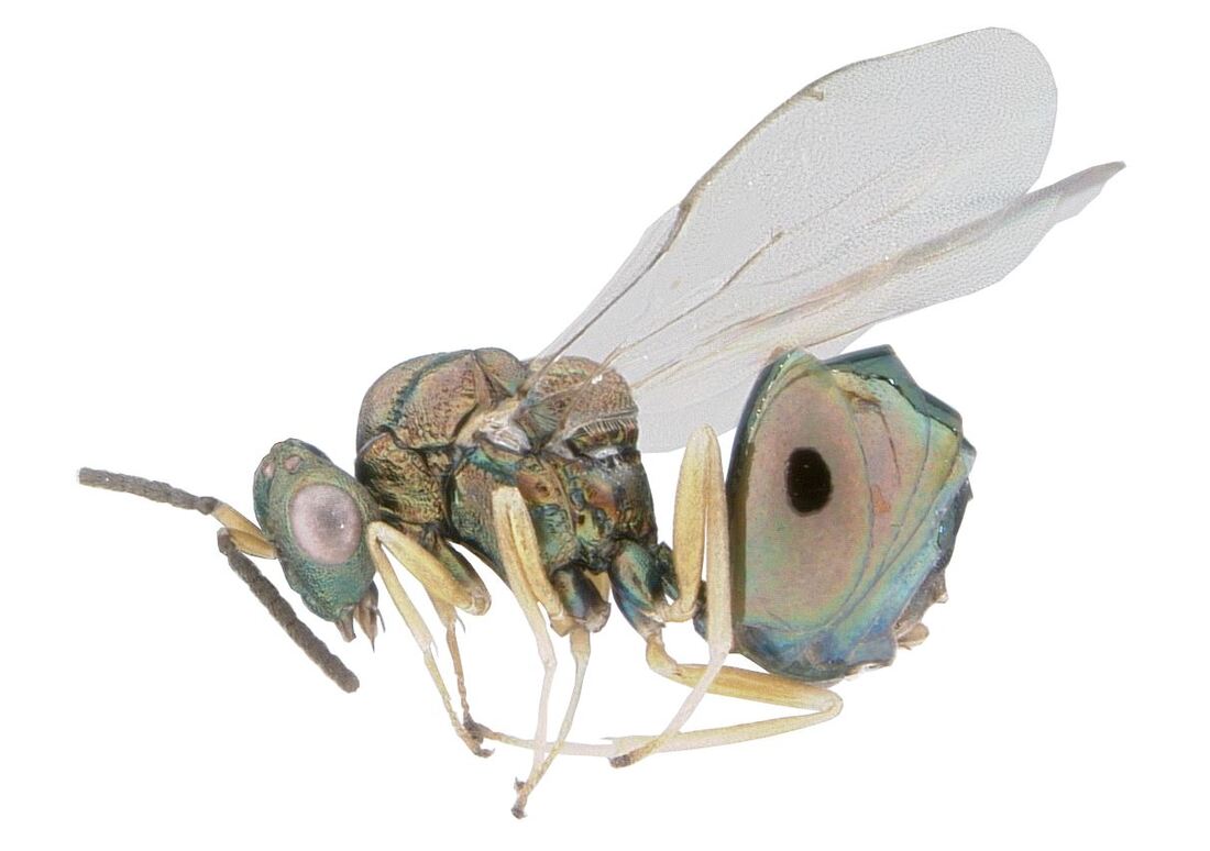
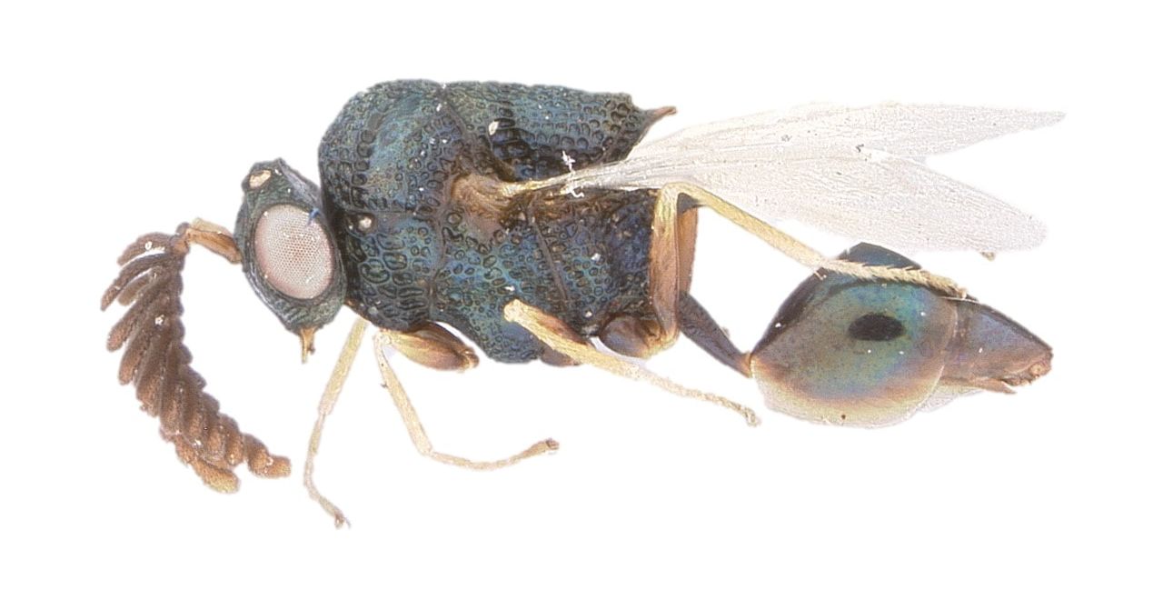
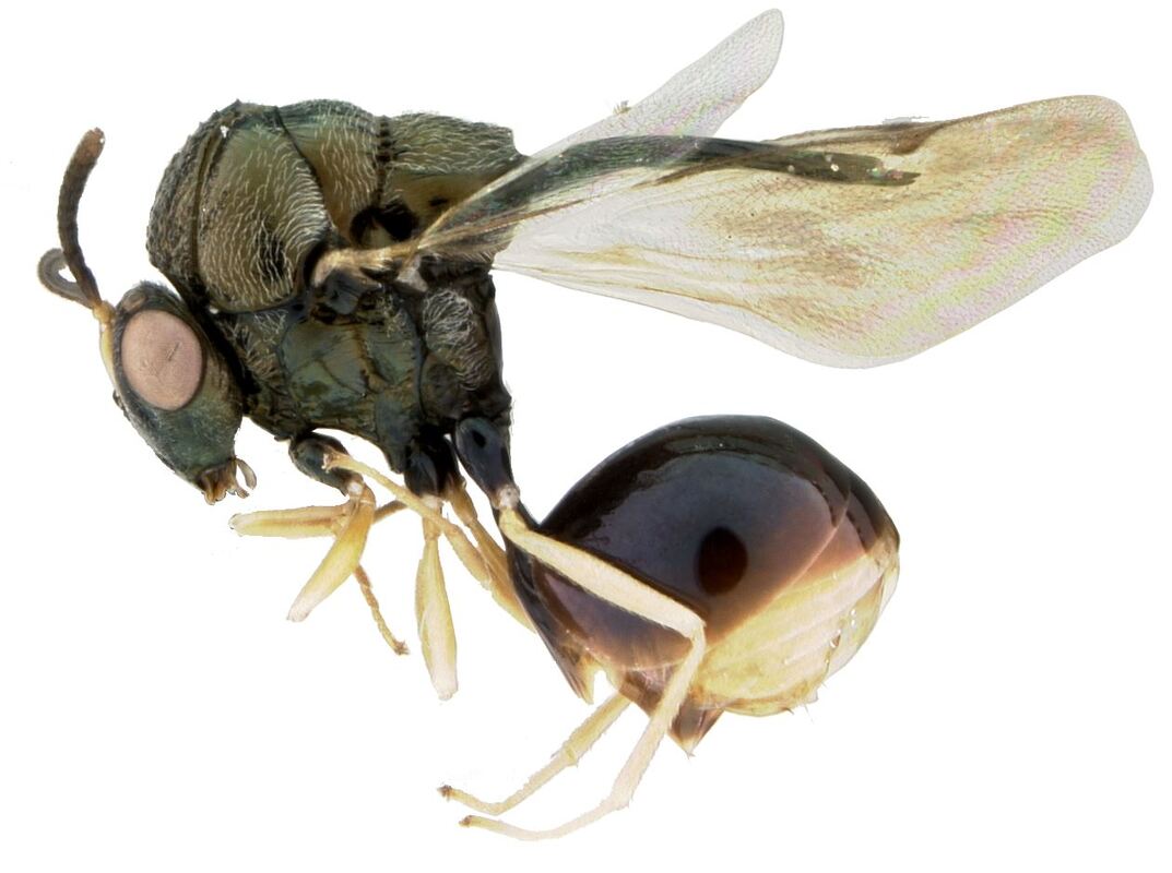
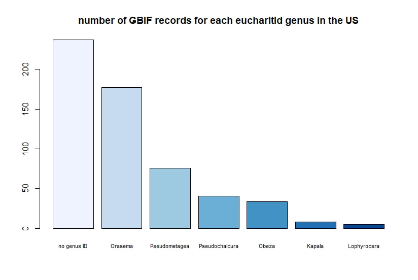
R + GBIF = rgbif Here is a tutorial for the R package 'rgbif'. This allows you to access specimen information in the Global Biodiversity Information Facility database. GBIF has hundreds of millions of species occurrence records from around the globe, open for anyone to use. How did these records get into GBIF in the first place? The data come from many sources -- various museums, universities, and other institutions. Specimen label data has been recorded and digitized in spreadsheets, and this info is contributed to GBIF. I wrote a script in R to demonstrate how to import records for a desired taxon found in a region, and then I use R functions to display the data.
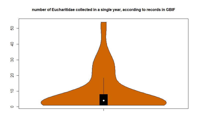
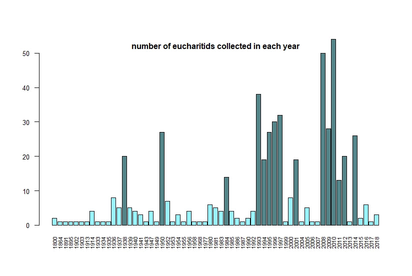
Below I display the number of eucharitid records per year in two different ways. On the left is a violin plot, which I think is a neat way to look at how data are distributed. The width of the violin is relative to the number of yearly records -- not the actual values, but a probability density distribution. The boxplot within shows the median value as a white dot. I excluded zeros here, so we aren't seeing the years where no Eucharitidae were recorded (this keeps the script slightly simpler). On the right is a chronological view of records per year, excluding years with zero records. I've distinguished the years having more than ten records by using a darker bar color.
I enjoyed exploring rgbif and thought it turned into a good introduction to how to plot data from a biodiversity database. I hope you try it out, too! Also, here's another rgbif tutorial I recently found that looks pretty useful; it focuses more on the data manipulation than the data display.
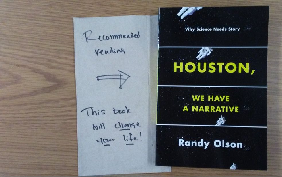
And. But. Therefore. These three words give a clear format for telling a narrative, writing a scientific abstract, or organizing a conference talk. After reading "Houston, We Have a Narrative", I have been incorporating this structure into my scientific work. Have you tried out 'ABT'?
Some scientists may shy away from visualizing their research as a story to be told, but Olson argues that a narrative is what humans are built to respond to. He defines a narrative (p 182) as "a series of events that happen along the way in the search for a solution to a problem". A narrative is not a fictional piece of work, and it doesn't have to be non-scientific. I'd recommend checking out the book! If you attended the Entomological Society of America meeting in Vancouver (Nov. 2018), maybe you saw Randy Olson's plenary talk. He explained a newer concept he developed called the 'Narrative Index' where he calculates the ratio of BUTS to ANDS (x100) in speeches or writings. Higher is better & shows a stronger narrative. For instance, he calculated the Lincoln-Douglas debates (Lincoln was better with a mean score of 20, instead of Douglas's score of 9.29). At the bottom of his web page, you can see what Olson has calculated for other presidents, and what he finds as Donald Trump's scores. reference: Olson, R. (2015) Houston, we have a narrative: Why science needs story. University of Chicago Press.
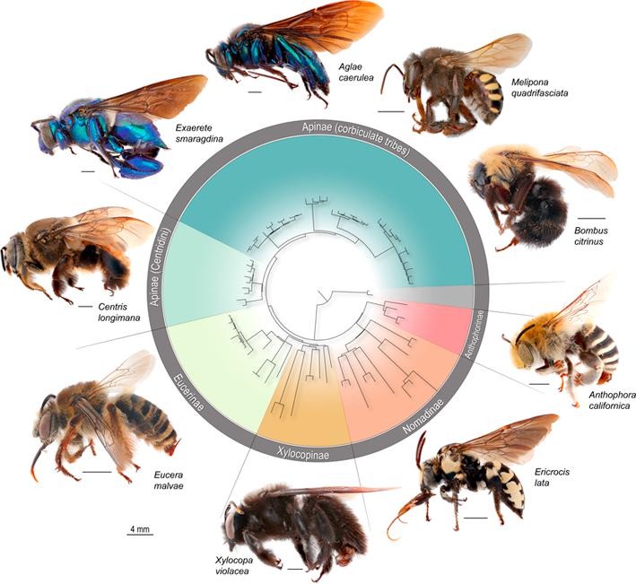
Did you know that bees evolved from within a group of solitary, carnivorous wasps, approximately 120 million years ago? Today, pollinivory – the consumption of pollen – is a defining feature of bees (aptly named Anthophila; the flower lovers).
In this study, one of the core concepts is the role of the ‘key innovations’ underlying biodiversity patterns. A key innovation is an evolutionary novelty which is believed to contribute to the success of a group. (For example, across all insects, some of the major transitions that are hypothesized to be key innovations include the origin of wings/flight, and the origin of complete metamorphosis.) Under the traditional definition of innovation, we would predict that a lineage with the key trait is more speciose than related groups lacking this key trait. The switch to pollen feeding has been assumed to be a key innovation of bees: the bees arose from within a group of carnivorous wasps, were able to exploit a new food resource, and today are extremely species rich. Our finding that not all bees exhibit a high diversification rate challenges conventional thought that the switch to pollinivory is directly responsible for increased bee diversity. We found that some of the earliest-originating bees did not partake in the diversification upswing. These results indicate that pollen feeding was an important evolutionary switch, but does not fully explain the diversity we see today. We postulate that other complementary innovations, such as a generalist host-plant diet, influenced the tremendous diversification of the major bee lineages. On a broader scale, this study contributes to an area of interest in the insect scientific community, of investigating whether diet shifts to plant-feeding contribute to higher diversity. Pollinivory is a specialized form of herbivory. Classic and contemporary studies have found a general pattern across insects that herbivory increases diversification (i.e., Mitter et al. 1988 & Wiens et al. 2015). We found that the evolutionary shift to plant-feeding contributed to bee diversification, but our results indicate it is not directly responsible for the increase in diversification rates. The Cornell Chronicle published an article on our paper! Read it here: Study Challenges Widely Held Assumption of Bee Evolution. citation: Murray, E.A. Bossert, S., Danforth, B.N. (2018) Pollinivory and the diversification dynamics of bees. Biology Letters, 14, 20180530. DOI: 10.1098/rsbl.2018.0530
Phylogenomic methods are incredibly popular, and there are various baits and probes for capturing different pieces of the insect genome for analysis. One of the next aspects of 'big data' will be to develop ways to combine all of these sources! My previous post covered a method for visualizing data on tree tips -- specifically I showed a plot of the number of loci recovered after doing a quick combination of genomes, transcriptomes, and UCEs (using the Phyluce pipeline). I'm happy to write that our research paper on the combination of phylogenomic data has been published in Molecular Phylogenetics and Evolution. Bossert et al. 2019 report successful results when three types of datasets are combined for Apidae (the largest bee family). 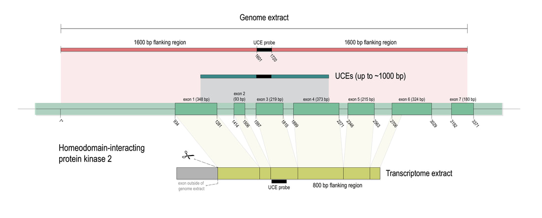 Bossert et al. figure 1. Graphical summary of the workflow developed for combining genome, transcriptome, and UCE data, exemplified for the widely shared HIPK2 gene of the honey bee.
references:
Bossert, S., Murray, E.A., Almeida, E.A.B., Brady, S.G., Blaimer, B.B. & Danforth, B.N. (2019) Combining transcriptomes and ultraconserved elements to illuminate the phylogeny of Apidae. Molecular Phylogenetics and Evolution, 130, 121-131. doi.org/10.1016/j.ympev.2018.10.012 Kieran, T.J., Gordon, E.R., Forthman, M., Hoey-Chamberlain, R., Kimball, R.T., Faircloth, B.C., Weirauch, C. and Glenn, T.C. (2019) Insight from an ultraconserved element bait set designed for Hemipteran phylogenetics integrated with genomic resources. Molecular Phylogenetics and Evolution, 130, 297-303. |
PhyloBlogCovering topics of phylogenetics and systematics & other science-related news. Archives
October 2019
Categories
All
|
 RSS Feed